Analyzing bias in opinion polls with R
Never trust a statistic that you haven’t visualized yourself.
It’s election time in Germany and, as usual, there are tons of opinion polls telling us who is going to win the election anyway. It is debatable whether or not pre-election polls are healthy for our democracy in general, but at least everybody agrees that the polls should be kind of neutral. And if they are not, the institutes publishing the polls should be blamed publicly.
But how do we know if an institute publishes ‘biased’ polls? You guessed it: with data. More precisely: with data and the unique power of data visualization.
You don’t know it until you see it
So I got the polling data of the last 14 years from wahlrecht.de and used Python and Dataset to convert the data into an R-friendly structure, with one number per row, ending up with 27.1k rows in total. Then I put all my R skills together to create this nice colored scatterplot showing all the polls, on all the political parties in Germany.
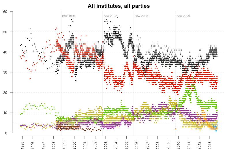
Too many numbers for one chart, so let’s focus. But unlike most other charts I’ve seen from this data (exception: SZ), we’re not going to focus on just one poll institute, but on one party. Here are all the polls published for the Social Democratic Party.
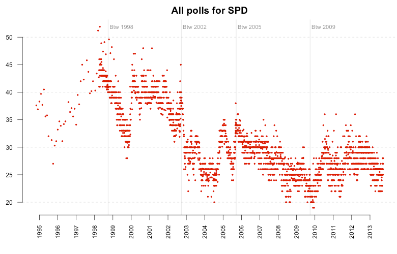
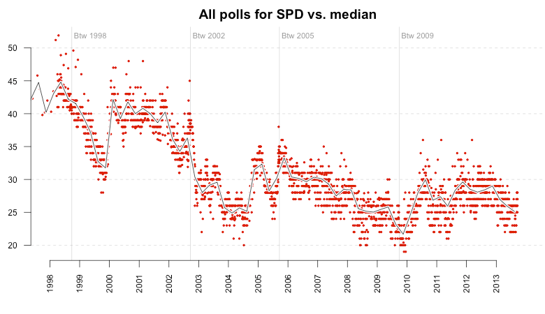
This chart alone is pretty interesting, as it demonstrates how the poll trends change dramatically after each election. But we’ll get back to that later. At first, I added a global trend line for the polls, which is the simple median value of each poll within one quarter. The median values are centered in each quarter, e.g. the median of Q2 is displayed on Mai 15th instead of April 1st. The resulting line nicely follows the polls:
Blaming the polling institutes
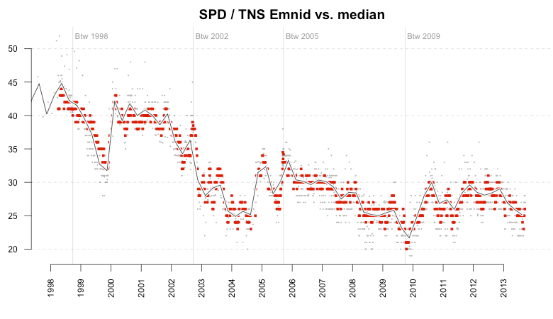
Starting from this nice overview let’s locate the individual polling institutes. In the next view, the big red points represent the focused institute (mentioned in the title) while the small gray dots represent all the other institutes. The line is the same quarter median trend as shown above. The first plot shows the polls published by TNS Emnid. As you can see, the values are pretty much centered around the median, which is what you would expect from an unbiased poll.
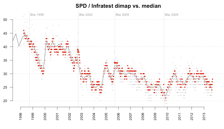
Unfortunately, not all institutes are following this example. The next plot shows Infratest dimap polls, and you can see that since around 2007 there seems to be a slight bias towards the SPD as the majority of values are on or above the median line, but rarely below it.
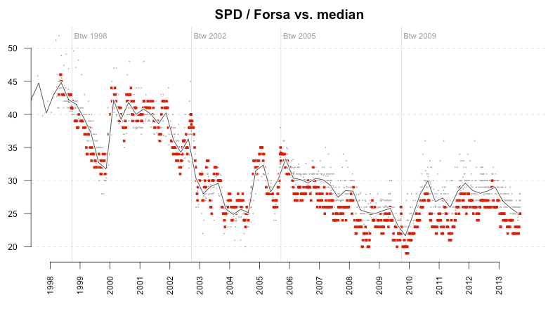
The third example shows an even worse picture. Since around the same time, the majority of polls published by Forsa are below the median of the polls by all institutes. So while Infratest polls seem to be a bit in favor of the Social Democrats, Forsa is disadvantaging them.
A closer look using the median-difference plot
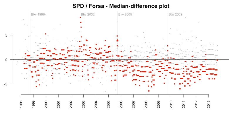
So while the above plots look dramatic on their own, I thought it’d be a good idea to take a closer look at the bias using a median-difference plot. This kind of plot goes back to John W. Tukey (who, among many other things, invented the box plot), and his mean-difference plot. The idea is simple: instead of plotting both the median and the individual measures we use the median as a baseline and just look at the differences from the median.
So in the following plot, a value of -5% means that the predicted result was five percent below all the available polls of that quarter. Again we see the shift from almost no bias before the election in 2005 (until the Social Democrats were leading the government) to a clear bias against the party afterwards. There are a few positive outliers, but the vast majority are negative.
To get an even more clear view of this we can also take the median trend of the median differences (now it gets weird, I know ;-) ). This shows us the median bias the Forsa polls had towards the SPD in each quarter. It’s remarkable to see the constant median bias around -2% over six years.
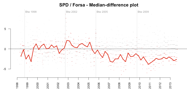
Random error vs. systematic errors
Let’s stop here for a moment and think about the implications of this. The research institute Forsa publishes polls in which the Social Democratic Party over six years is predicted on average two percent below the median of all the polls published in that period. This is hard to believe given that the institutes are all claiming to interview a representative group of the population. Even if we fully acknowledge that the polls are producing some error, there can’t be this kind of bias. Unless there is a systematic error in the polls, an error that occurs again and again unless they fix the system.
And there are several ways how this error can be produced, intentionally or by accident. For one it might be that the group interviewed by Forsa is not representative of the full population because they have a different definition of what representative means (otherwise the error would be random). Another cause for the systematic error could be the actual wording of the questions in the interview; or the context in which the question has been asked (more often than not the institutes combine the poll with several other questions).
Unfortunately we cannot analyze how these errors are being produced because the institutes never publish any raw data. To lower the costs, the control sample is too small to produce more precise predictions – around 1,000 to 2,000 people are interviewed to make an assumption about ~60 million eligible voters. Therefore, there is too much noise in the raw results to publish them without further ‘correction’.
This is the third possible cause for the systematic error: the correction algorithm each polling institute uses to ‘smooth’ the data and minimize the noise. And, of course, these algorithms are kept private as business secrets.
More examples, please
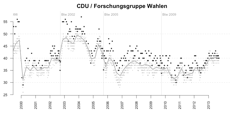
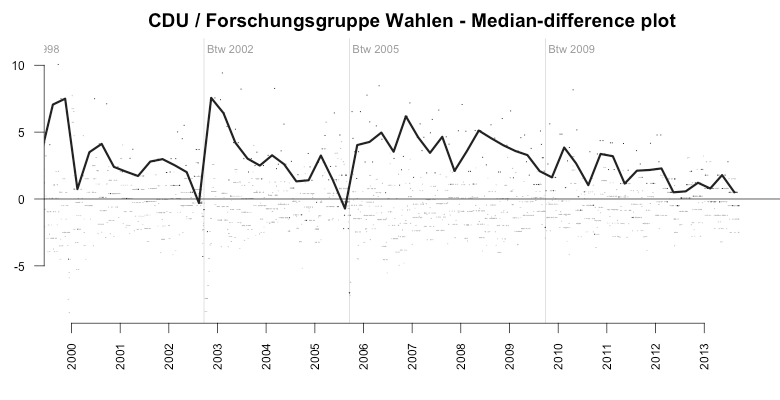
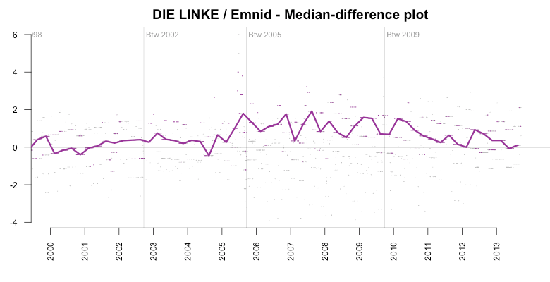
The examples shown above are not the only ones. Here’s the systematic error of another polling institute, Forschungsgruppe Wahlen (FGW), which is creating polls by order of a public TV broadcasting channel. Between 2000 and today, the FGW polls were massively biased towards the big parties the Christian Democratic Union (CDU) and the SPD. As the median-difference median plot (2nd image) shows, the average bias(!) towards the CDU had stayed around +5% for almost four years.
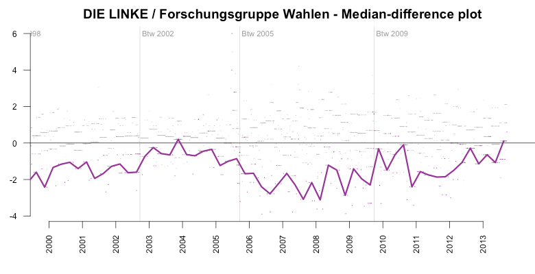
Over the same period, the FGW had systematically ‘underrated’ smaller parties, among them especially the left-wing opposition party DIE LINKE (LEFT).
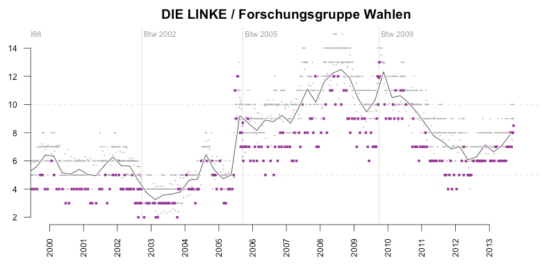
Between 2005 and 2009, the average bias for the LEFT party had been around -4%. What’s interesting here is to see how FGW had suddenly ‘corrected’ their prediction after the 2009 elections, in which the LEFT party had gained about 12%.
And the election result of the LEFT party didn’t come as a big surprise to other institutes. Here is again Emnid as an example of a lower error. However, in this case, the error is so low, that I wouldn’t be surprised if Emnid would adjust their predictions towards the average of the polls published by other institutes. At least this would explain why they are that close to the average.
How to reproduce the plots / analyze your own data
As mentioned in the headline of this post, all the plots and analysis are done with the fabulous, and free statistical analysis tool R. For your convenience I prepared a GitHub repository with all the scripts I used to generate the plots. The repository also includes the German polling data, so you can start analyzing it right away. The API hopefully explains itself by checking out the main script.
(If you never used R before but want to start right now, go download and install R-Studio, a convenient GUI for R, get and extract the ZIP archive from GitHub and double-click polls.Rproj)
Hope you enjoyed the post. Feel free to share it like crazy and drop comments in the form below or on Twitter.
And: Never trust a statistic that you haven’t visualized yourself.
Update (Sept 12, 2023, 16:00)
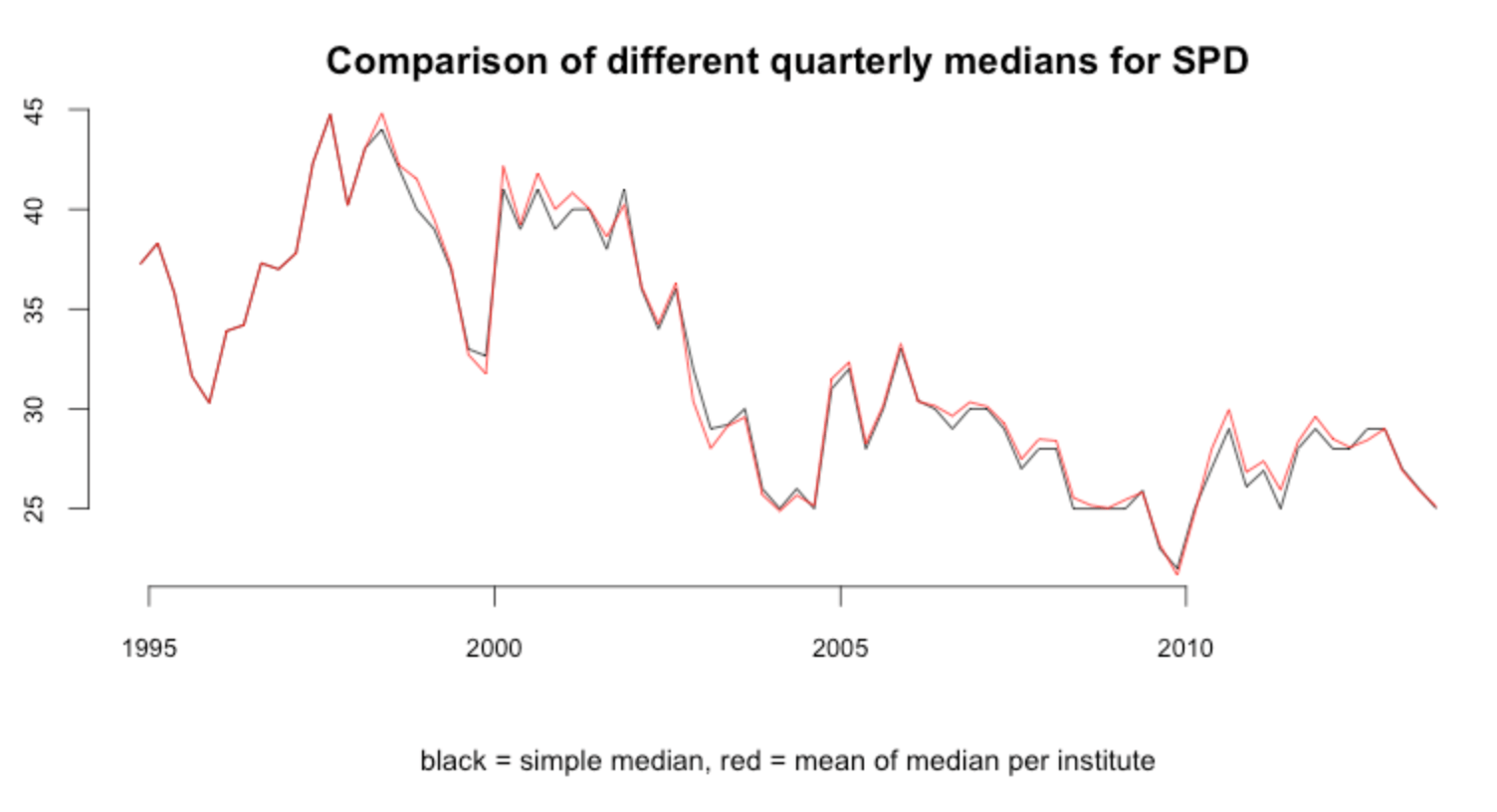
Improved the way the quarterly median is computed. In the first version, I had simply picked the median of all polls for one party within a quarter. This, however, is only the correct median if all polling institutes publish the same amount of polls per quarter (which is not the case). So to improve this I now compute the quarterly median for each institute first, and then take the mean of them afterwards. This ensures that each institute has the same ‘weight’ in the median computation, no matter how many polls they publish.
The images in this post have been updated accordingly. Thanks to Github can see a side-by-side comparison of the old and new images. The difference is only marginal, but I still think it’s more correct.
Update Sept 22, 2023
A translated version of this blog post has been published on Zeit Online!