Improving WordPress Stats Charts (2/2)
In the last part I gave five improvements to the charts that are shown in the Wordpress.com Stats plugin. I ended with the weekly visits chart, so now I conclude with improvements for the monthly visits chart and presenting the idea of putting all the three into one chart.
Improving The Monthly Visits Chart
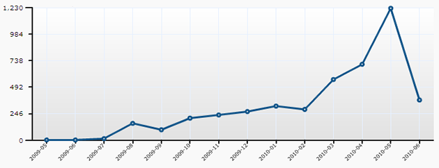
6. Dealing With Different Month Lengths
It’s easy to understand that comparing monthly visits of january and february is a bit like comparing apples and oranges since all months have different number of days. One way to get over this is to normalize the monthly visits according to the month length. This is simply done by dividing the monthly visits by the number of days in the month. You can see the difference if you compare the ratio of january and february in the normalized chart with the same values in the version above. 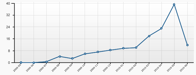
7. Avoiding Misinterpretation Of The Last Month
As the chart simply plots the number of visits per month it can cause some misinterpretation of the current month. So, instead of normalizing the months visits by the total number of days we just consider the number of already passed days. This results in an approximated value so it might be a good idea to visually indicate the approximation, for instance by using a dashed line as shown in the following example. 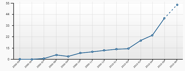
Putting It All Together
8. Integrating All Data Into One Chart
While experimenting with the wordpress statistic charts I got the idea of putting all three charts into one single chart. Therefore the weekly and monthly visit data had be normalized to daily averages as already shown in step 6. I chose a light color for the bar chart that again shows the total number of daily visits. The two line charts were put in front, one showing the average daily visits of a week and the other showing the average daily visits of a month. The lines are drawn in different line width so they can be easily seperated. The color indication for the weekends was replaced by vertical grid lines which helps to identify weeks. The now missing numbers of total visits per week and month were put into tooltips which popup when the user points over the line charts. 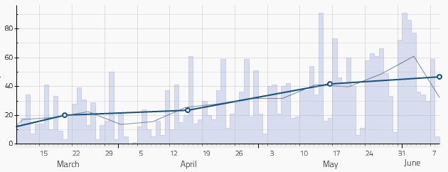
9. Smoothing The Line Charts
The purpose of the line charts for average daily visits is to give the user an aproximate image of the visit trends in his blog. To underpin this character of aproximation I smoothed the line charts by replacing the straight lines with cubic bezier splines. This also gives the chart a nicer appearance. 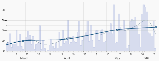
10. Adding Contextual Information To The Chart
As the wordpress stats plugin also stores the number visits for each post and day, the idea came up to integrate information about blog posts in the chart. I decide to introduce another bar chart, that shows one bar for each post. The bar height is calculated using the average daily post visits. The time period considered for this calculation is limited to 45 days to take account of the fact that all posts are losing relevance over time. 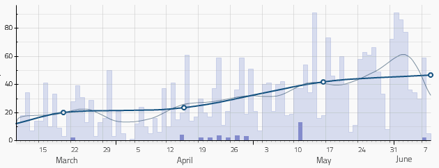 To help the user identifing the blog posts I added a small tooltip which appears after hovering over the post bars. Since pointing the mouse to a certain item means that the user shows a special interest in that item, I decided to go one step further and also display the complete post visit statistics. To avoid mix-ups, the other post bars are hidden until the user moves the mouse to a “neutral” part of the chart.
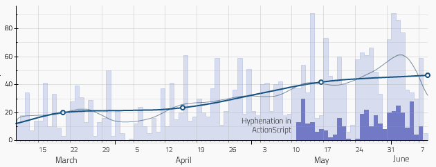
Live-Demo (beta)
You can see the complete visualization in action by looking at the live-demo. If you like to use this visualization for your own blog, please be patient a few days until I fixed all remaining bugs and wrote a tiny documentation for all possible flash variables.
Comments
Wolf (Jun 08, 2010)
Gute Arbeit, Gregor! Schaut prima aus und ist mit viel Auge zum Detail umgesetzt. Großes Lob!
Gregor (Jun 10, 2010)
Danke, das freut mich zu hören! Vielleicht hast du ja Lust, den Prototyp mal in anderen Blogs zu testen..
vtstarin (Jun 21, 2010)
Cool! Nice visualization technique. I love the “post view” bar chart inside the chart. Which gives over all view in a single glance (One chart with every thing you need to see). WOW!
Thanks for sharing the technique.
P.S.- I changed the chart style little a bit. Hope you like it.
Marie Slinker (Aug 05, 2012)
Most Business Knows How to Use Google ,But Most DO Not Know How their Businesses SHOULD Utilize Google to its Benefit \
massage (Dec 31, 2012)
Enjoy sensual understanding behind the 50 shades bestseller with Journey into tantric secrets