Further Ideas For Piwik Visualization Improvements
In this post I want to present two ideas for improvements to the current Piwik visualizations.
Screen resolution stats
The first idea is about improving the screen resolution charts. Here is an example for the current available visualizations in Piwik: 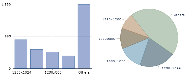 The current charts (pie,bar) aren’t quite applicable to get an useful overview about the visitors screen resolutions. Both charts are limited to a few big values and combine all other values in the “others” element. This can lead to wrong interpretation of the data, since there might be many different screen sizes. In the example nearly the half of the sites visitors have screen resolutions that arent’ displayed in the charts. The obvious reason is that pie and bar charts are made for simple, one-dimensional data sets but the number of visits per screen resolution is a perfect representative of two-dimensional data sets. The two dimensions are obviously the screen width and the screen height. One of the simplest yet best visualization type to display two-dimensional data sets is the scatter plot. You can see the difference in no time by looking at the following prototype. In my opinion, this is the only way to make the screen resolution stats usable.
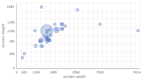
Browser statistics
My second idea is about the browser statistic charts. Again, there is only limited use to the currently provided charts. 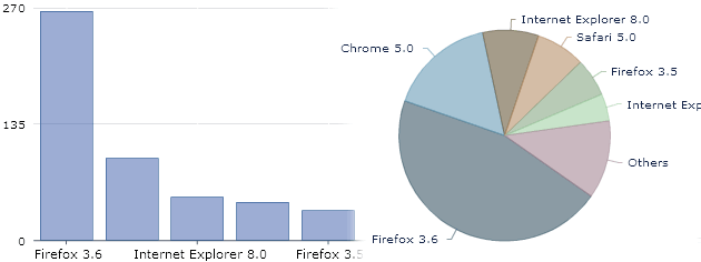 The chart shows data of multiple browsers in multiple versions. Each combination of browser and value is treated as a distinct value and hence is shown in a unique color. The main problem of the current visualizations is (again) that the data is treated as one-dimensional. The data is in fact a hierarchical data set: the first layer is the browser _layer which contains the sub-layer _browser versions. One way of making a visualization more useable is to decrease the complexity, which can be done by only showing the _browser _level.
 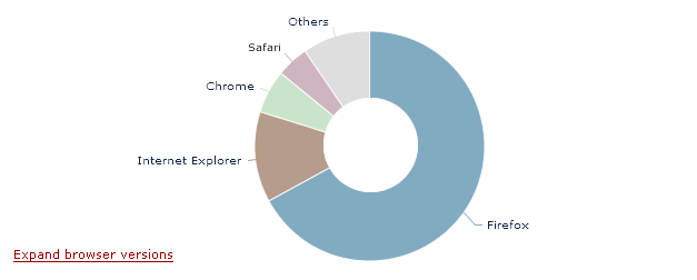 The visualization now clearly shows the information that is asked by most of the Piwik users: Which browsers are used by the visitors of my website? Some users might also want to know more details about the different browser versions, so there is a link to an second view that shows all browser versions.
 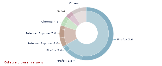 Feedback welcome..
Comments
vtstarin (Aug 09, 2010)
Scatter plot for screen resolution is really brilliant idea.
Thanks for sharing.
pascal (Oct 09, 2010)
This would be fantastic, especially the browser chart improvement!
Stop Smoking Now (Dec 06, 2010)
Thank you for enriching the On-line entire world with this post!
my website is http://dogshirt.org
Also welcome you!