Finding a Good Data Source For a World Map
Last year I contributed a Flash-based world map to the open source Piwik Web Analytics project. At that time, all of the Piwik charts where rendered in Flash, but as with release 1.5, all Flash charts were replaced with JS/canvas charts. Now, my map plugin is the only Flash component in the whole project, which is why they asked me if I could rewrite it in SVG. I will take some time in October to do this and I want to write here about my work. In contrast to many past projects where I wrote making-of like posts after finishing, I now want to write while working – literally. This kind of invites everyone interested to take part in the design process and, besides of that, provides a good amount of documentation and tutorial-like resources. So, let’s start the project. A year ago, I already wrote a proposal for some new features for the Piwik map, which I now want to implement. The first part of the work will be to prepare the maps, the second part will be to render the maps using SVG and, presumably, a JS/SVG framework like RaphaelJS. The process underlying the first part looks like this: 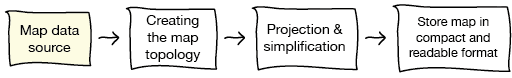 In this post I will focus on the initial step, the map data source.
Finding a map data source
The biggest challenge was to find map data of inner-country regions (like the U.S. states, the German Bundesländer or the Regions of France) for all countries of the world. Initially I thought of extracting the administrative boundaries from the huge OpenStreetMap database, but this is not as easy as it sounds. Finally I decided to look for other data sources – and succeeded. I found gadm.org, a website whose entire purpose is to provide free map files of the worlds administrative boundaries and they had exactly what I was looking for: a shapefile of all countries with their first-level sub-divisions. Update: I will use the Natural Earth shapefile instead of GADM, see below. 
Handling huge shapefiles
After unpacking, the shapefiles where 439MB big. I wanted to know a little more about the data before starting to actually work with them, so I wrote a small Python script to get some information. There are plenty of Python libraries for reading shapefiles, I kind of like this one, mostly because its simplicity. So here’s the script:
import shapefile, csv
create a new csv file for writing and write csv header
csvout = csv.writer(open(‘shp_meta.csv’, ‘w’))
open the shapefile and read records
sf = shapefile.Reader(‘gadm1_lev1.shp’) shape_records = sf.shapeRecords()
for record in shape_records: numPoints = len(record.shape.points) numParts = len(record.shape.parts) shapeMeta = record.record csvout.writerow([ numParts, numPoints] + record.record)
The first interesting fact is that executing the script took my Macbook a little more than three minutes and the RAM usage peaked at something around 3GB(!). This means that the script might not run on some machines. Maybe I should consider trying out other shapefile libraries later, to test their shapefile reading performance.
Analyzing the map data
However, here’s the resulting csv file. The most interesting thing about it is what is stored in the shape record dBase metadata. Fortunately, the shapefile stores the countries ISO codes, which I need for mapping them to the country ids used in Piwik. Next good thing is that we also have official two-letter codes and names language for the level-1 boundaries. The names are provided both in English and in the countries local language, which is very good since we can use them later for the map rendering. Another thing of great interest is the quality of the shapefile. The big file size is a first indicator for a high level of detail, but I wanted to know more about it. This is why I added two more columns: the total number of points per shape and the number of shape parts (a shape may contain multiple parts, which are polygons in our case). To analyze this data in more detail, I loaded the csv file into R, which is a great (if not the best) software for data analyzing:
data = read.csv(‘shp_meta.csv’, header=TRUE) pc = data$point.count sc = data$shape.count country = data$iso3 region = data$region.code
The first thing I looked at was the total number of points in the shapefile, which is 28.5 million points(!) or something around 8500 points per shape.
sum(pc) [1] 28565495 mean(pc) [1] 8486.481 plot(pc)
However, after looking at the scatterplot of point counts I saw that only few of the shapes seem to have that much of points. 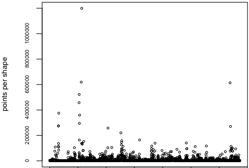 Here’s a look at the distributions of parts per shape, points per shape, points per part and points per country. I used a boxplot of the log10 counts for each measurement. One can now see, that the median of parts per shape is at 10^0, which means that at least half of the shapes consist of only one part. However there are some shapes that are made up of almost 10^4 or 10000 shapes, which I assume to be near pole-regions that contain many small island-like parts. The points per shape has it’s median at 10^3 or 1000 with a few outliers to the top. Points per country peaks at 10^6, which means we have to deal with up to one million points per country.
 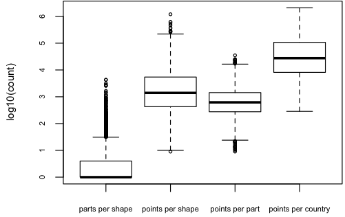 Of course I wanted to know what countries and regions are responsible for those outliers in point counts, so I replaced the dots with labels. Interestingly, it’s Chile, Canada and the United States.
plot(pc, col=“white”) text(1:length(pc), pc, iso3)
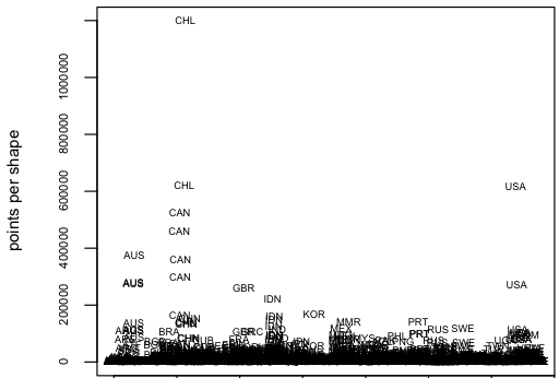 This is the region Magallanes and Antártica Chilena, which is the one with an outstanding number of about 1.2 million points.
 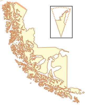 One of the next smaller regions is Alaska, which has about 600 000 points.
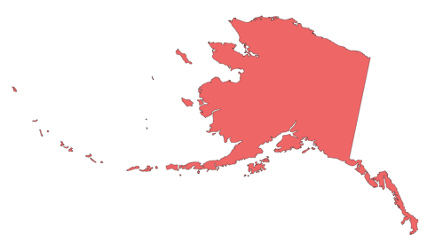
Closing thoughts
Since the admin-level 1 shapefile doesn’t contain the admin-level 0 boundaries, at least not explicitly, we will either need to compute them using the “outer” regional boundaries of each country, or take them from the admin-level 0 shapefile from gadm.org. Obviously, 1.2 mio points for a single shape are way too much for display in a browser using SVG. Therefore, in the next session we will proceed with map projection and the polygon simplification process. We will take a good look to Magallanes and Antártica Chilena then.
Update (Oct, 25)
Unfortunately, the GADM maps are licensed under a not-so-free license, which doesn’t permits commercial use. Also, it seems that GADM doesn’t update their shapefiles very frequently, since it still doesn’t contain South Sudan. Fortunately, Manu told me about Natural Earth, a site which I doesn’t only provide hi-res images of the earth (which I initially thought), but also provides detailed shapefiles. I checked the Admin 1 - States and Provinces shapefile and it contains South Sudan. And all data is licensed as public domain. That’s not a great reason to switch. So, no GADM anymore.
Comments
Peter (Oct 07, 2011)
Very interesting read, greg. I’m quite curios about the result. I think this will be huge!
Manu (Oct 09, 2011)
Nice work and thank you for your interesting insights! I’m wondering if you also checked the NaturalEarth data set? In contrast to GADM, their data is in public domain, which seems more suitable for use in an open source project.
matt (Sep 26, 2011)
Excellent introduction post and excited to read the next ones! :)
Gregor Aisch (Oct 09, 2011)
Thanks for noticing the NaturalEarth data. For some reasons I thought that the site is only providing hi-res renderings, didn’t knew that they also provide the shapefiles. However, I just checked the admin-level-1 borders shapefile and it seems that this data isn’t yet complete.
Do you think there is a problem with the GADM license?
This dataset is freely available for academic and other non-commercial use. Redistribution, or commercial use, is not allowed without prior permission.Piwik is non-commercial and we don't aim to redistribute the shapefiles itself (just a few projected maps which are partly built using GADM shapefiles).
Manu (Oct 09, 2011)
Yes, they are still missing some small admin-1 data: “Antarctica, some disputed areas, tiny island nations, and principalities such as Monaco, Andorra, Liechtenstein, and San Marino.”
Unfortunately, I’m not an expert with licenses. I was just wondering what would happen if someone takes the map functionality out of Piwik for use in other (maybe commercial) projects. Therefore, I thought it might be easier to just take public domain data in the first place. However, the way you are planning to use the GADM data seems okay to me…
Moving on with the Piwik Maps — vis4.net (Oct 25, 2011)
[…] entry is part 2 of 2 in the series Recreating the Piwik Maps in SVGRecreating the Piwik Maps in SVGRecreating the Piwik Map in Python, JavaScript & SVG – Part 1: The ShapefileMoving on with the Piwik MapsHere’s a short documentation of my current progress in re-creating the […]
Mikael “MMN-o” Nordfeldth (Dec 24, 2012)
Hey, have you looked at OpenStreetMap? They have metadata in their maps about administrative regions, complete with polylines.
And all OpenStreetMap’s maps are freely licensed ODbL (Open Data Commons Open Database License), a free share-alike license.
Given all the effort you seem to put into finding maps, I believe using an existing free database would be very useful. All that’s needed is a tool for extracting this data from OSM for specifically the administrative regions. Which is even likely to already exist .)
Their OpenLayers library (javascript) is also really good and can handle conversion between different projections et al! :)