Worlds Biggest Companies
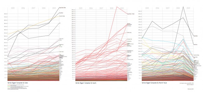
I’m very proud to present my current visualization, which is my first serios step into the Processing framework. It shows some financial data of the world’s biggest companies, tracked over the last 6 years. I took the data from Forbes2000-Index, which you can find on forbes.com. As I tried to do this in ActionScript, I faced a couple of problems:
- The dataset contains 3.150 records, so the rendering process would took very long. More than 19.000 line segments are definitely to much for a fluid flash visualization.
- Another problem is the information density in the lower part of the charts which requires a high resolution of the visualization graphic. Unfortunately the flash player limits the maximum bitmap size to about 4.000 * 4.000 pixels.
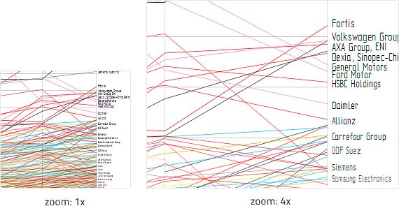
So, I chose Processing because of its possibility to render huge datasets and to export high quality PDF-documents. I found it very easy to get into the framework with the help of the book Visualizing Data by Ben Fry, the online reference and the countless code examples. Line coloring by company category The 3.150 companies are grouped into 27 categories like “Oil & Gas Operations” or “Software & Services”, which I wanted to map to the line colors. As the maximum number of effectivly distinguishable colors is at around 7-10, I decided to group the categories into seven supergroups, for instance one for basically monetary businesses like Banking, Diversified Financials and Insurances. Logarithmical change of line widths and alpha If you ever tried to place 3.500 lines in a single line chart, you know that there is very less space, especially in the lower part where. To keep the visualization optically pleasent, I decided to logarithmically decrease the line widths and transparency according to its vertical position. This has a nice side-effect of a dynamic visualization when zooming deeper in a pdf viewer, because the viewer renders lines at a minimum line width.
Dynamic data labeling
I wasn’t quite sure how to implement the data labeling. Obviously, it’s impossible to show all company names, but I wanted to show as much information as possible. That’s why I used a dynamic font size, that decreases from top to bottom. To avoid overlapping labels, I simply left out those which wouldn’t have enough space. The algorithmn shows good results but has the disadvantage of missing labels among the most important records. I added an exception that forces the labeling of the top twenty companies and corrected their label positions manually. Btw, does anyone know a good and simple labeling algorithm that’s able to solve this problem?
Feel free to download the visualization to take a closer look on it or view it online at scribd.
Comments
Christoph (Mar 04, 2010)
Nett. Wirklich nett :-)