Visualization and interpretation of weather station data
There’s some kind of hype around climate data these days. Since the UK’s National Weather Service recently published an enormous set of weather station data files there’s a growing number of visualizations spreading the net. Among a few other examples I found this very nice and clear looking chart:
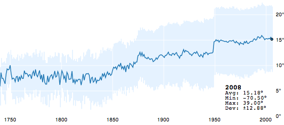
It’s showing the average world temperature over the last 250 years. Looking at this chart your first thought is something like: Oh my god, it’s getting hot on earth. But wait a minute. An mean temperature increase of 10°C in only 200 years? And what about this hard step around 1950?
To answer these questions I had to step deeper into the data. Therefore I made a visualization myself, that simply shows a world map with all weather stations. The temperature range is from -70°C (dark blue) over 0° (white), 10°C (yellow), 32°C (red) to 40°C (dark red).
The video goes through 3 loops showing the mean temperature (MT), the summer mean temperature (SMT) and the winter mean temperature (WMT). One of the major insights you get from seeing this is the unequal and unsteady distribution of weather stations around world and time. While there are only few stations outside europe in 1850 the world is almost complete “filled” in 2000.
Did you notice how suddenly Africa fills with weather stations around 1950? To get a clearer look at the distribution of weather stations I made this stacked area chart:
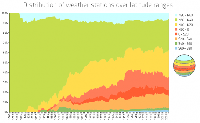
You can see that there was a steady increasing number of weather stations in the near equator regions. You can even find the peak around 1950 in this chart.
As it’s always warmer near the equator than near the poles and this temperature difference is much bigger than the estimated increase over 200 years, one cannot simply average the data from unevenly distributed weather stations. The more stations you have in africa, the higher your global temperature gets.
What you have to do instead is something like taking the average of the average temperature of the weather stations on the same latitude. I think this type of error is called a systematic bias.
So, who is going to make a corrected version of the firstly shown chart?